
How do you make meetings and meeting technology accessible?
It’s a topic that’s been getting a lot of attention lately. I believe that access to technology is a fundamental digital right. Technology has become the backbone of everything we do, whether it's work, play, or healthcare. Where you live, what language you speak, how old you are, your level of technological expertise, or any disabilities you might have should not make a difference. Everyone should have equal and equitable access to video communication, especially when video technology is now used to power key services like telehealth, government-to-citizen (G2C), financial help, and education.
Read on to discover how the Pexip Design and User Experience team creates more accessible meetings through our products and video meeting technology.
- An accessible UX for ease of use
- An accessible UI's use of color
- Visualizations and intelligent insights
- Meeting equity and adaptive composition
- Pexip's accessible meetings certifications
I’m passionate about accessibility, which factors into my work at Pexip every day as Head of Design and User Experience. We’ve always had accessibility at the core of our strategy in designing Pexip products and accessible meeting solutions. We often develop features nobody ever asked us to – because our usability research suggests it's the right thing to do. I’d like to share some examples of how we try to go above and beyond the call of duty to make our products accessible for back and front-end users.
Designing an accessible UX for ease of use
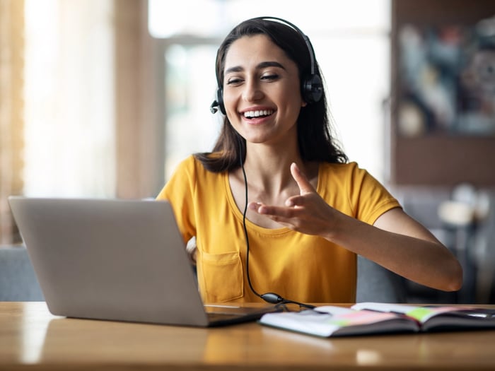
In a broad sense, one of the driving forces for video adoption has been accessibility – making services accessible to people who live far away from a government office or who can’t meet in person due to illness. So, the video makes services more accessible, but if we take the next step, how do we make the video user experience (UX) more accessible?
The user experience has always been a high priority for us at Pexip, and we do our best to make our technology easy to use and understand. Users should be free to join video meetings from wherever they want and feel at home when switching between our apps. To accomplish this, we work hard to ensure our video apps are consistent in design, ease of use, and performance across devices, products, and web browsers.
We also make integrating auto transcription, closed captioning, and language apps easy. The latter can be used for live interpretation of meetings and translating the user interface, which we’ve designed with enough flexibility and customizability to enable all relevant buttons and icons to be localized. Our design philosophy is based on minimalism and simplicity to create the simplest and best UX possible.
An accessible UI uses colors strategically
How you use colors, text, and contrasts in the user interface (UI) of software can make a world of difference for the visually impaired while improving the average user's ease of use and productivity. For instance, some of the accessibility design choices we make at Pexip include the following:
- Using color contrasts strategically
- Supporting a high-contrast mode
- Making each icon look different by using colors
- Combining visual icons with text
.jpg?width=800&height=450&name=Infinity_Products_Liveview_watermark%20(1).jpg)
Performing searches in the UI is another area where design plays an important role. Accessible design can help empower users to find what they are looking for quickly while giving those with impairments or disabilities an easier way to navigate the system. We worked hard to ensure the color scheme used for displaying search results is colorblind-friendly and easily accessible.
Turning walls of text into intelligent insights
If you’re familiar with backend management UIs or have worked in system administration, then you know how tedious it can be to look through data to troubleshoot or detect potential issues. Unfortunately, the traditional situation is that you’re faced with walls and walls of text. Even if you haven’t personally sifted through logs, I’m sure you can imagine this is not easy on the eyes.
To improve this experience, we use visualizations in our Infinity Management Portal as much as possible. These visualizations take the raw data and present it in a three-dimensional manner instead of flat screens. We make data actionable by showing this visualized system data in real-time and allowing users to play it back. We also provide smart and customizable alarms and warnings so users can automate part of the system monitoring process. See the video below:
I already touched on how we strategically use color to make the UI easier to navigate and read for both power users and the visually impaired. This also has a crucial role to play regarding walls of text in logs. It is almost blinding, and you can miss key patterns if the logs aren’t designed accessibly. Look at how we’ve mixed blue with white to improve the accessibility of logs in Pexip Infinity.
.png?width=800&height=446&name=Screenshot%202022-02-23%20at%2013.21.06%20(1).png)
Meeting equity: equal "squares" vs. equal participation
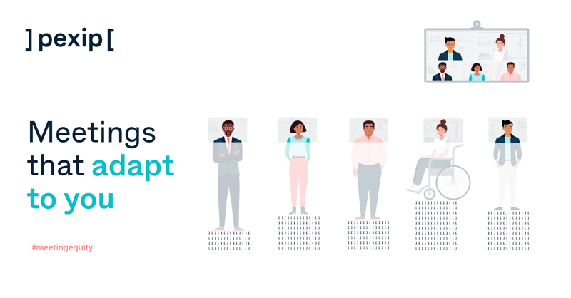 In the quest to make video meetings more accessible for the modern workforce, meeting equity has recently received the design attention it deserves. Creating equitable meeting spaces ensures everyone can participate and be seen and heard, regardless of who they are, what location they're joining from, what device they’re using, or any personal barriers they might have to access video communication. One of the things I’ve seen lately in the market is a focus on making people “equal” in meetings, which isn’t always the same as providing them with an equitable experience.
Say you’re hosting a meeting with 49 people, and everyone has an equal-sized square on the screen. What happens? It just gives the appearance of equality. But there’s too much happening on the screen, and it’s hard to concentrate and be productive. It also requires that participants push their way to be seen, which disadvantages those with less assertive personalities.
At Pexip, we believe that the ability to participate actively is more important than the mere appearance of equality. So we developed our AI-driven adaptive composition technology to detect faces, frame them by cropping, zooming, tilting, and panning, and arrange the layout to give large groups and active speakers more screen real estate.
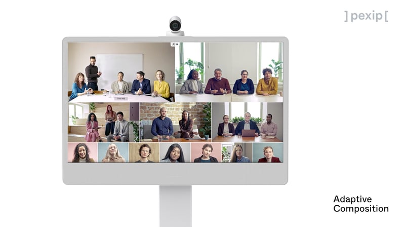
All of this is done automatically behind the scenes and is adapted to the size and context of the meeting. After all, every video meeting is unique regarding the optimally equitable screen layout. Adaptive composition results in better eye contact, more natural face-to-face conversation, and more productive meetings for all participants. This is our way of easing participation and making meetings more equal and accessible. We want to enable our users to move naturally, express themselves freely and feel more empowered, whether it's an appointment with a Doctor, Sales Assistant, Teacher, Colleague, or Family Member.
In our most recent updates to Pexip Infinity and the Pexip Service, we have also introduced several layout options to choose from so that you can use the layout best suited to your team’s unique needs and the goals for your meeting.
Pexip levels the playing field
Pexip levels the playing field by creating more accessible meetings. It complies with accessibility standards AAA WCAG 2.0, Section 508, Americans with Disabilities Act, and Accessible Rich Internet Applications (ARIA). It includes features like high-contrast mode, screen reader support, and customizable UI elements like colors and text.
Customers can also integrate Pexip with other solutions, including closed captioning and transcriptions, to improve accessibility. Each of these capabilities improves usability for people with disabilities so they have an equal seat at the table.
Stay up to date with our product updates and upgrades, and get insight into more ways we create accessible meeting experiences for. Sign up for our Product Spotlight Newsletter.


